adidas Originals
Brand Experience
Creating an original way for adidas Originals to present its personalty, attitude and product within a unique brand experience, whilst setting the new standard of retail design.
Design
|Build
|Installation
|
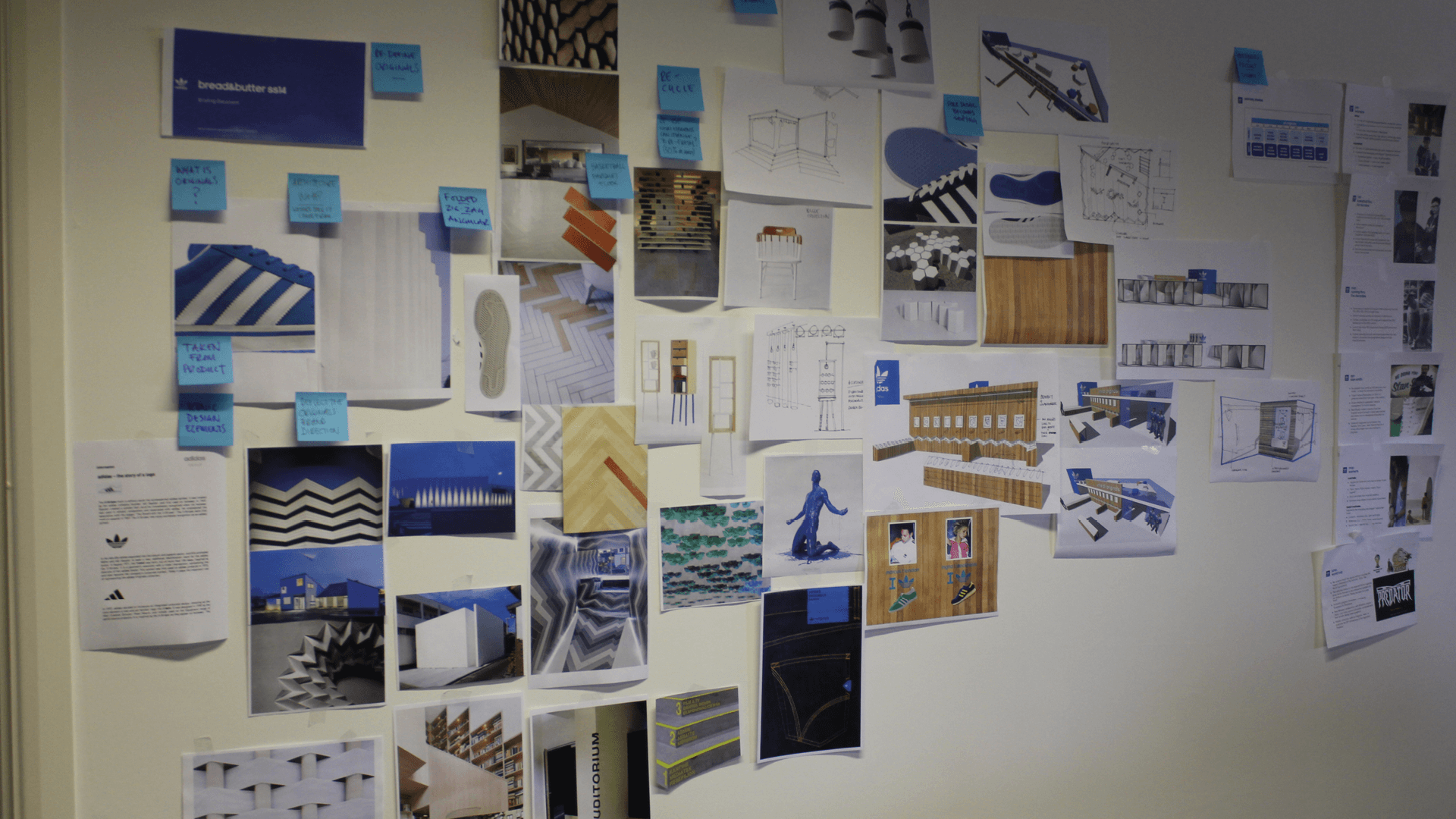
Architecture Inspiration
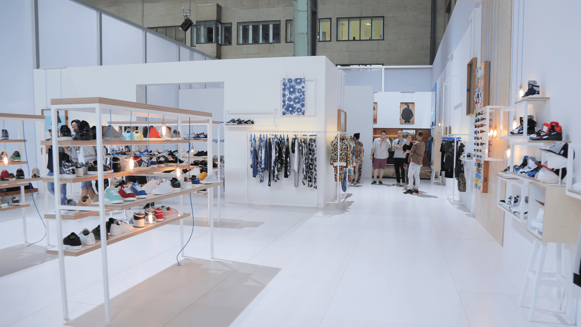
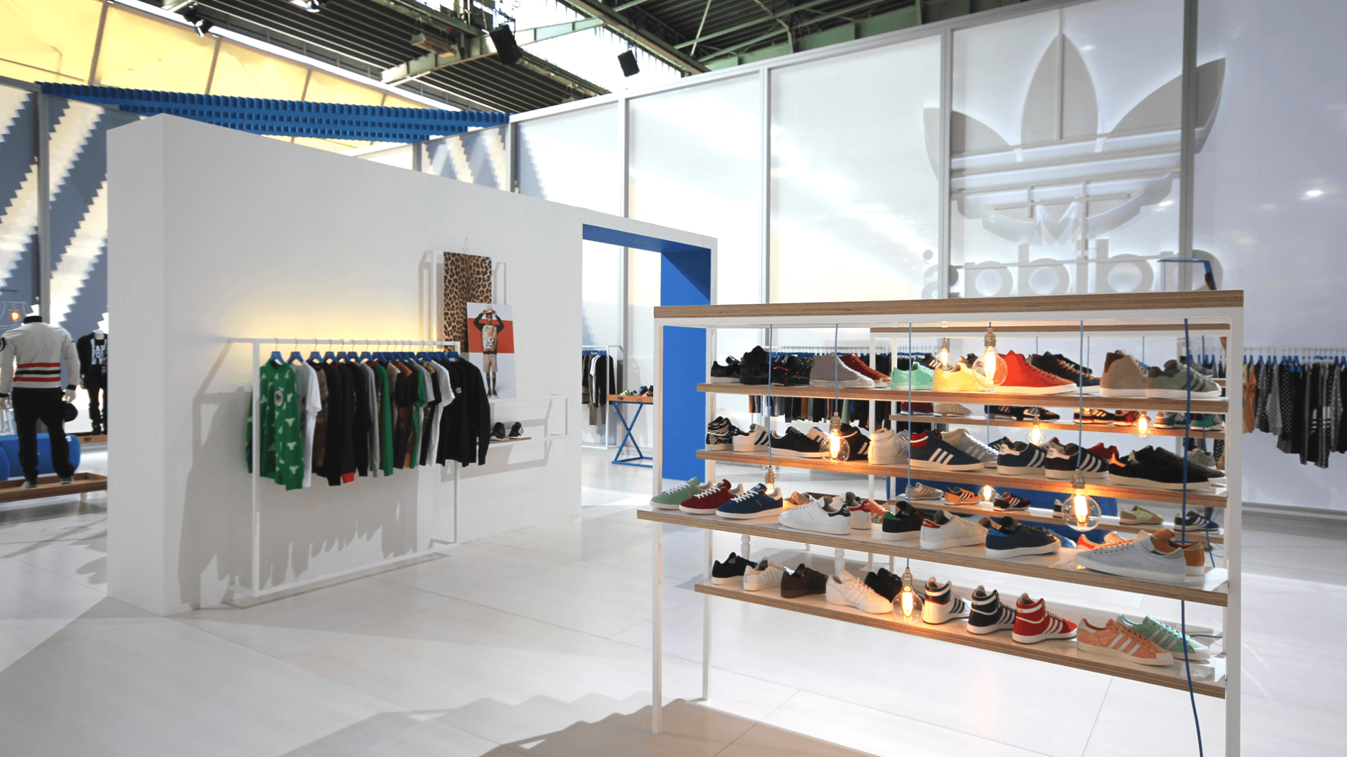
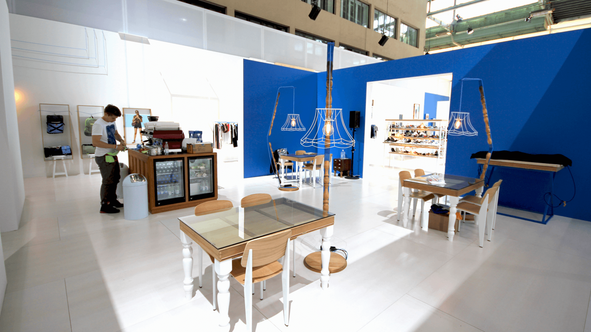
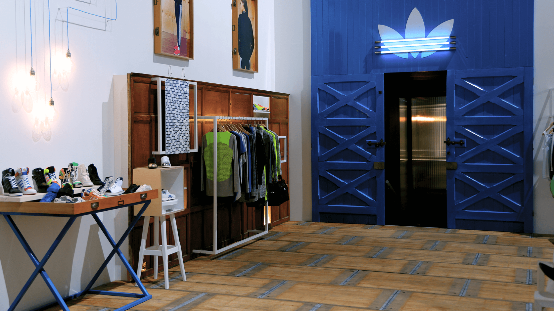
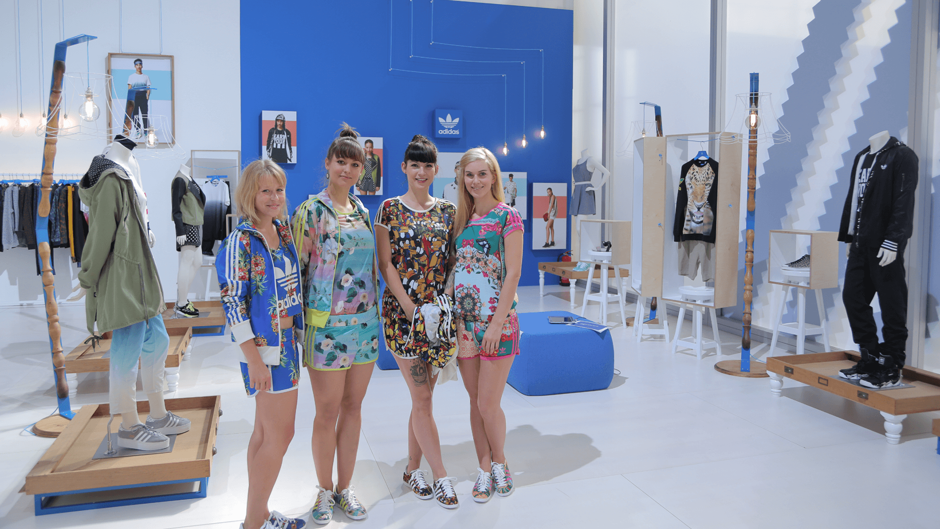
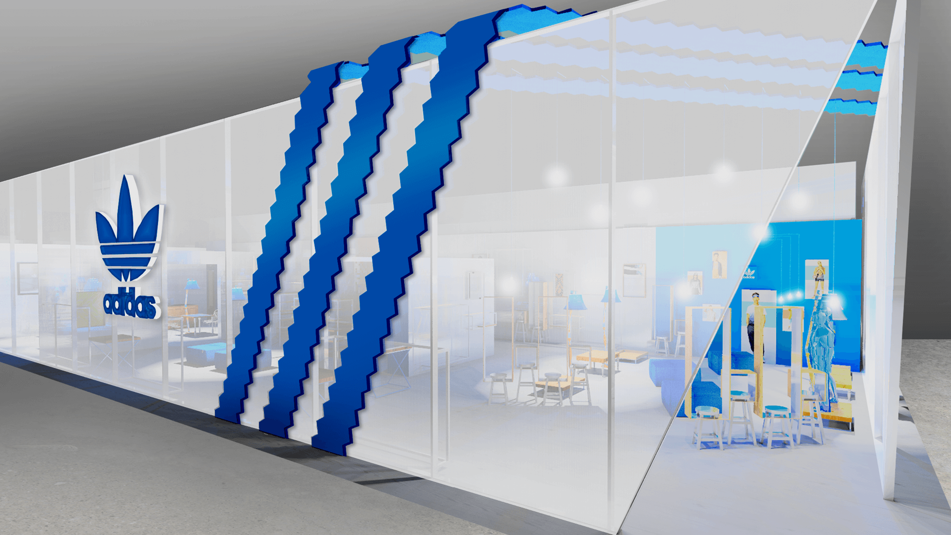
We wanted to own Bread & Butter Berlin by confidently highlighting core brand elements such as the iconic trefoil and 3 stripes on a big scale, whilst reflecting technical product features within the material palette and texture of the exterior. We built to the maximum height of 6m to dominate the trade show.
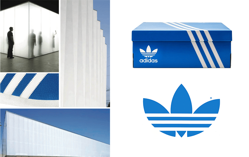
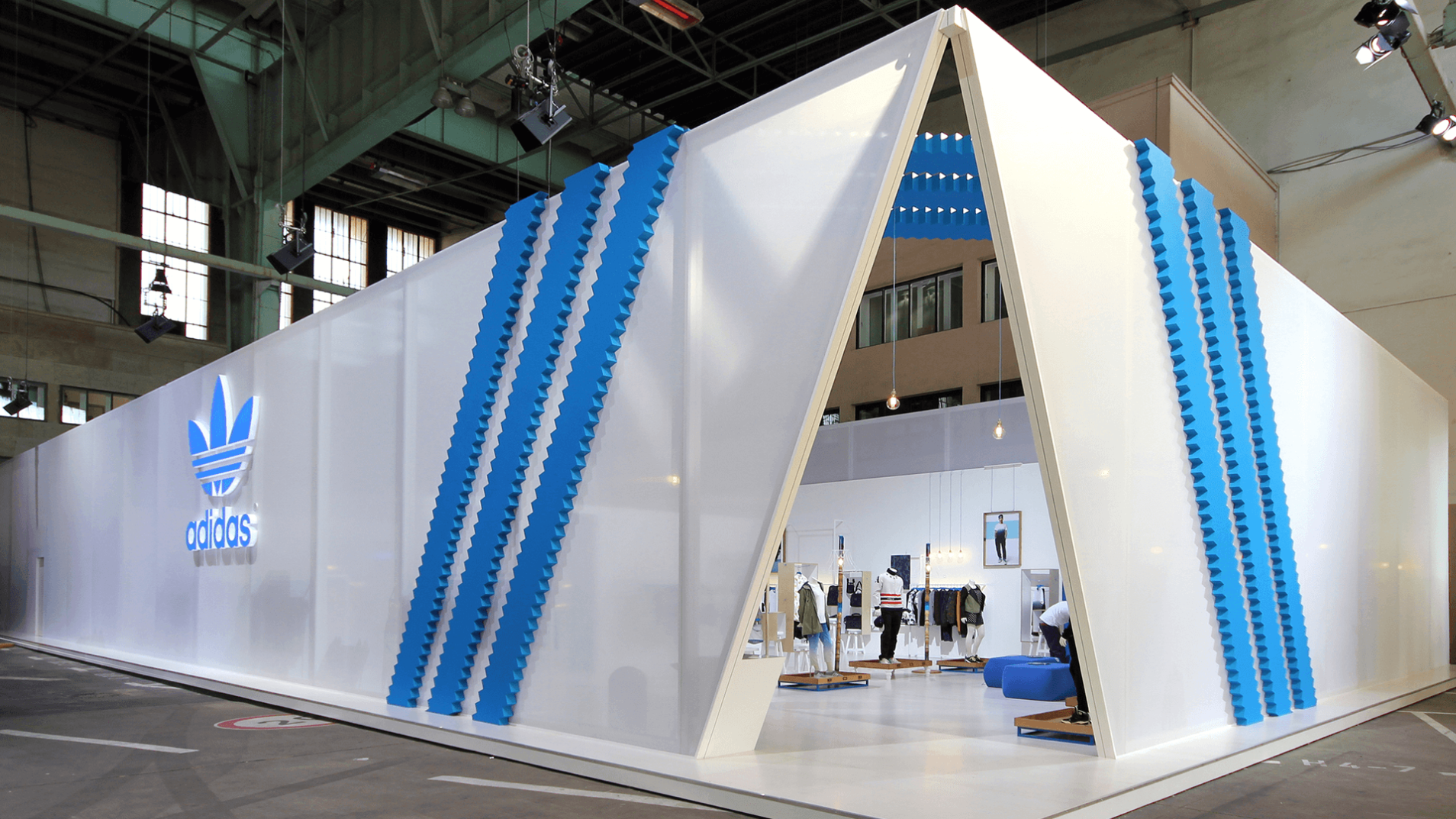

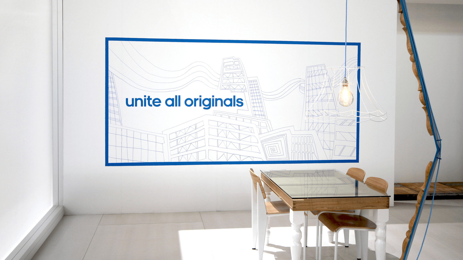
The opportunity existed to evolve brand statements to a unique mix of shape, form and materials that inspire and intrigue. Product presentation, visual merchandising and the design of the booth takes its ‘original’ inspiration from the brand.
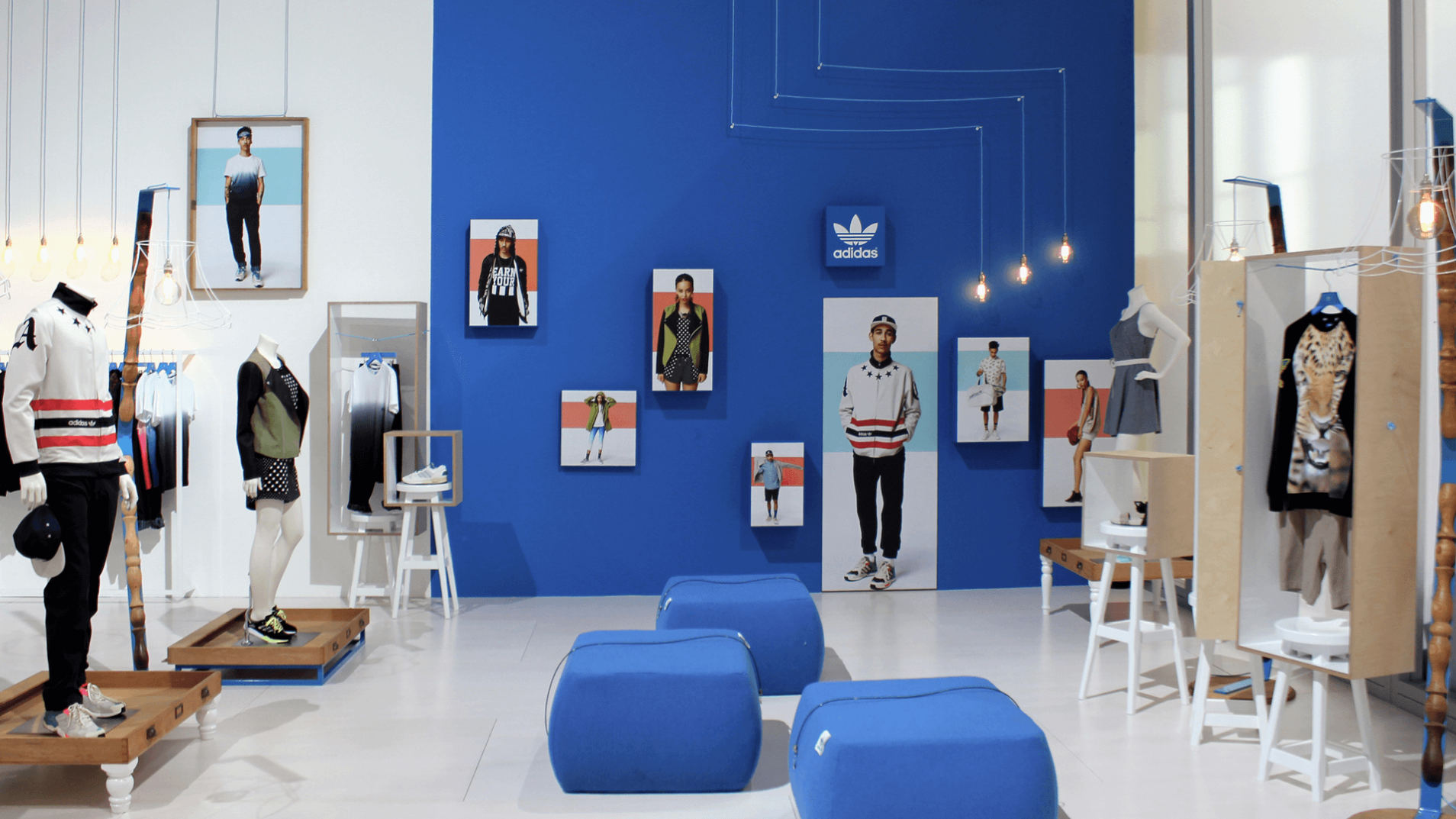
Original Merchandising
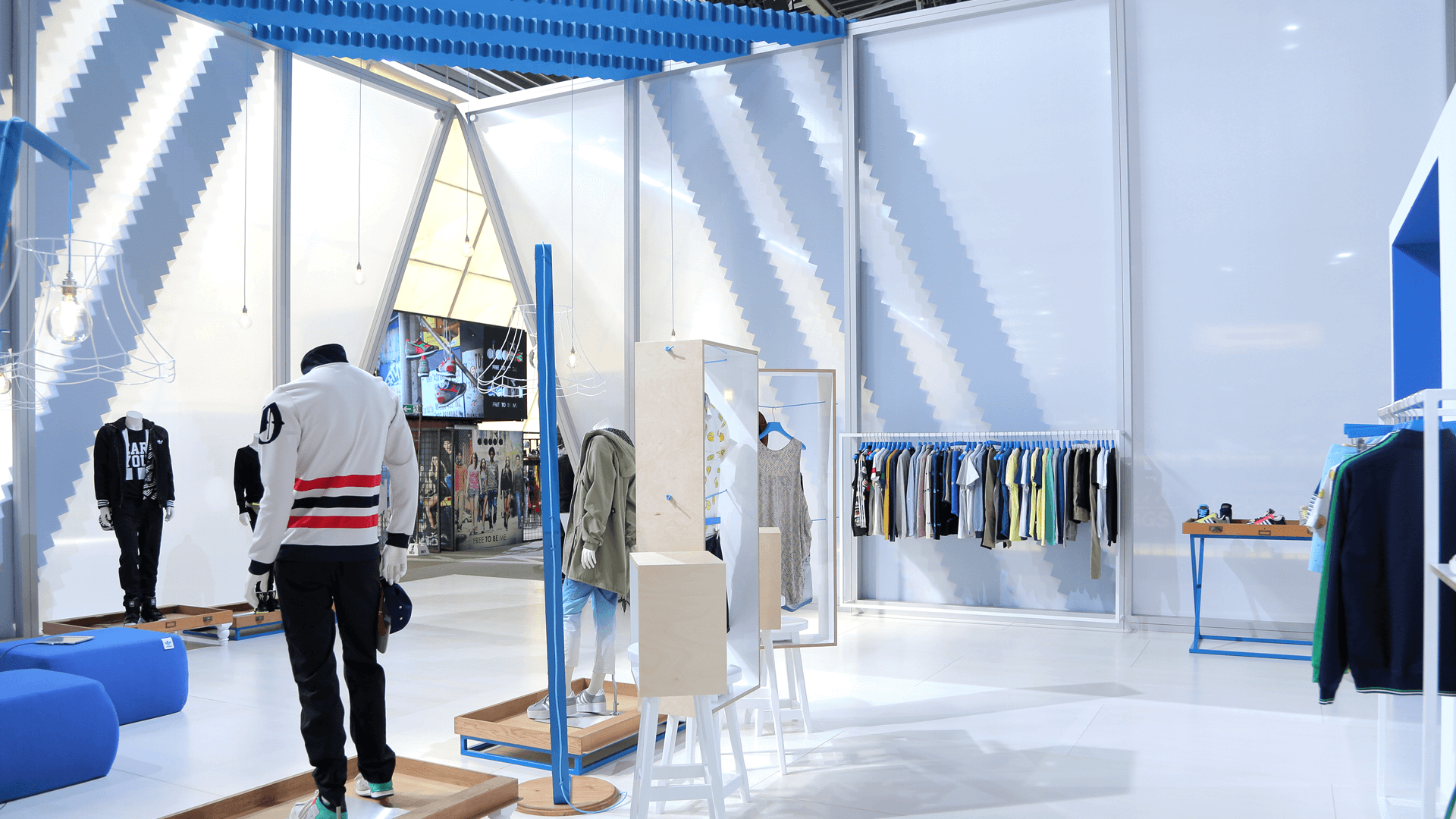
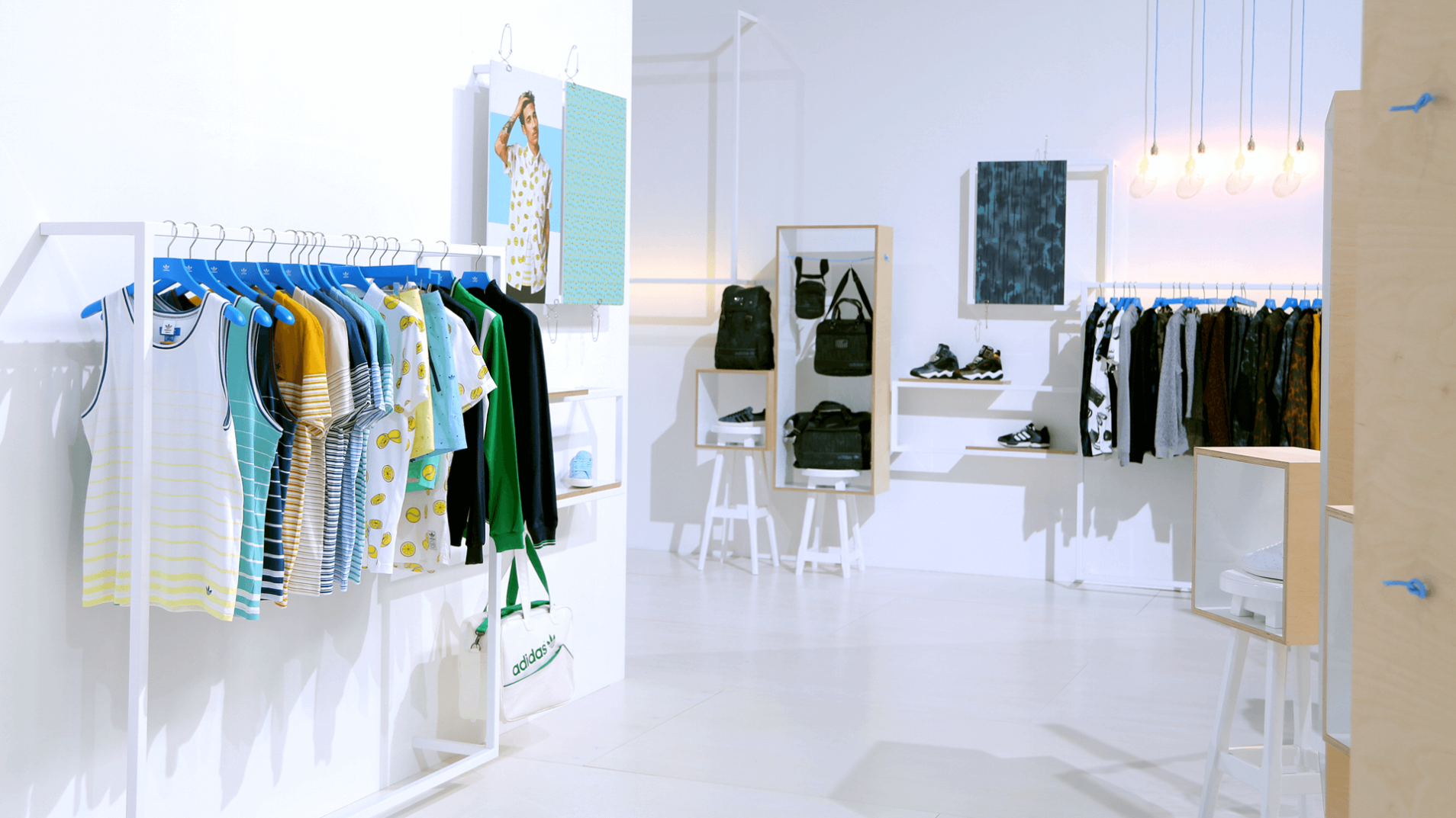
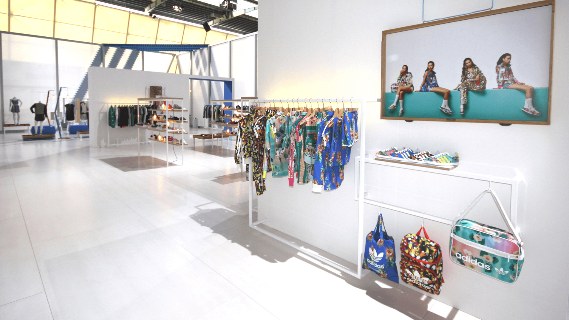
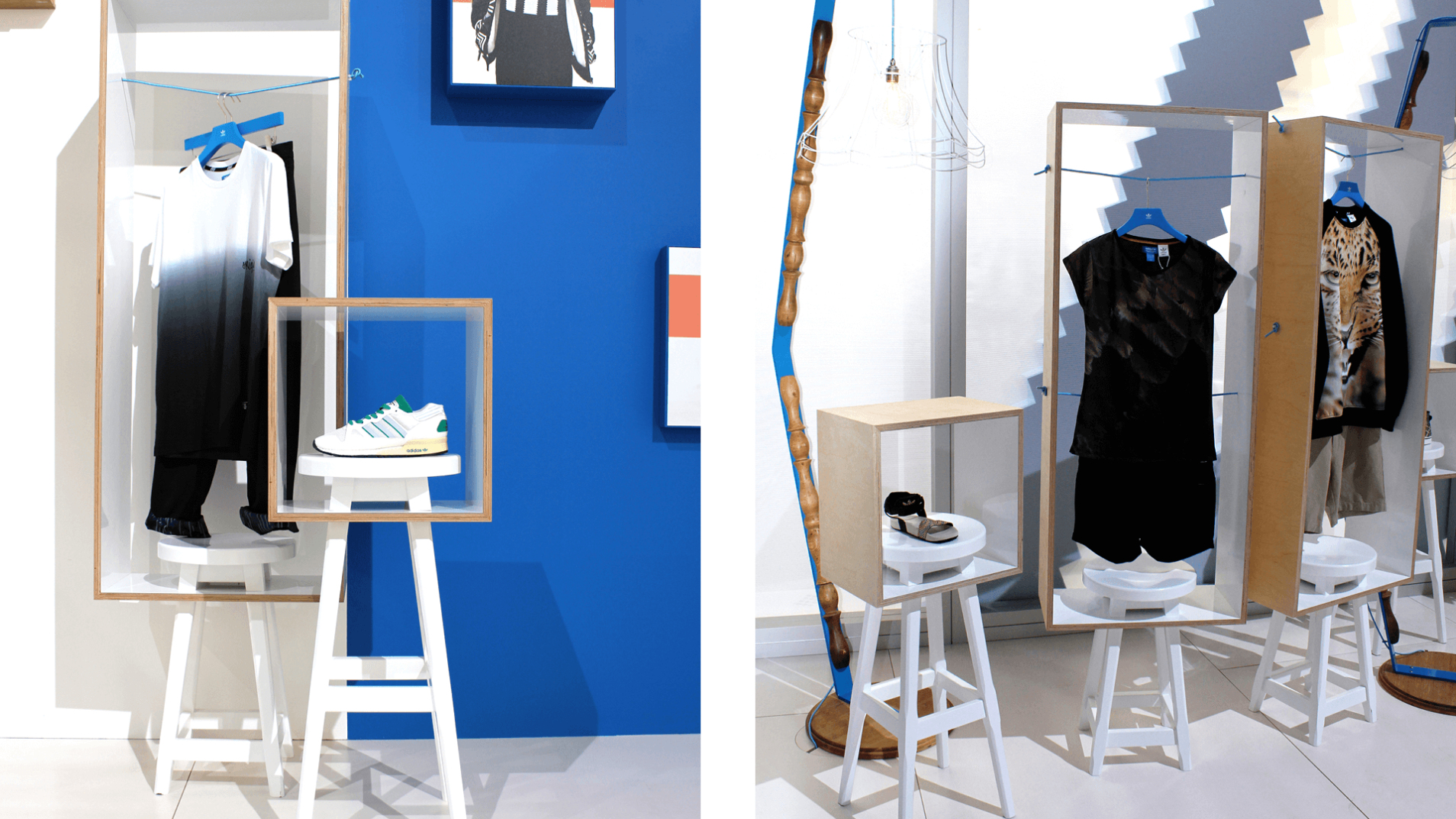
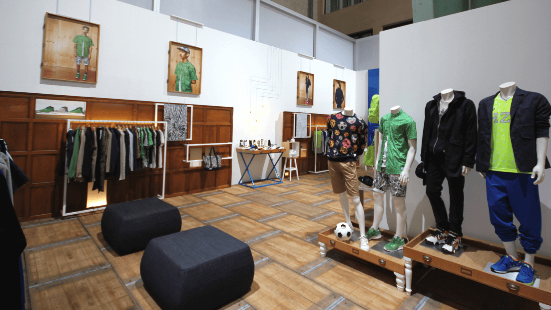
We created an ordered but flexible product merchandising framework using layered, simple steel sections for hanging graphics and product highlights.
Simple white painted walls create the backdrop for gloss white frames and original timber textures. The whole interior becomes a tactile experience.
Purposeful Design
Our sustainable design approach extended to our hospitality offerings as well. Plan chest drawers were repurposed into table tops for meetings, while reimagined lamp shades added an unconventional yet striking design feature. Their unique wireframe design provides an industrial yet whimsical appearance, without overwhelming a space intended for respite.
Injecting Contrast
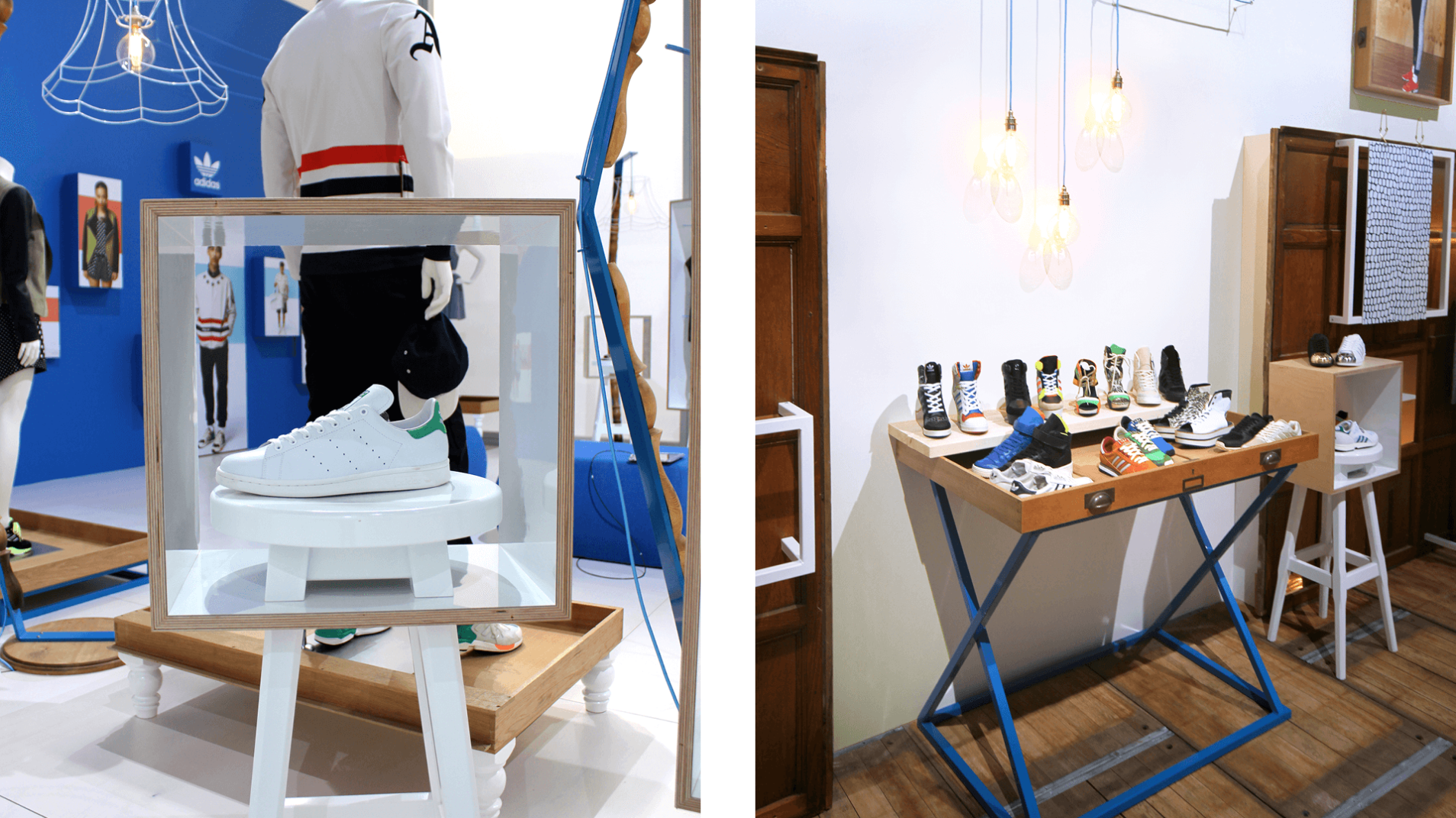
Contrast is introduced through authentic pieces of reclaimed furniture which we up-cycled and re-configured into new, original formats.
Towards the rear of the space, we increased the level of original textures by incorporating flooring made from pottery shelves and perimeter wall cladding reclaimed from an exclusive gentleman’s club.
Making A Statement
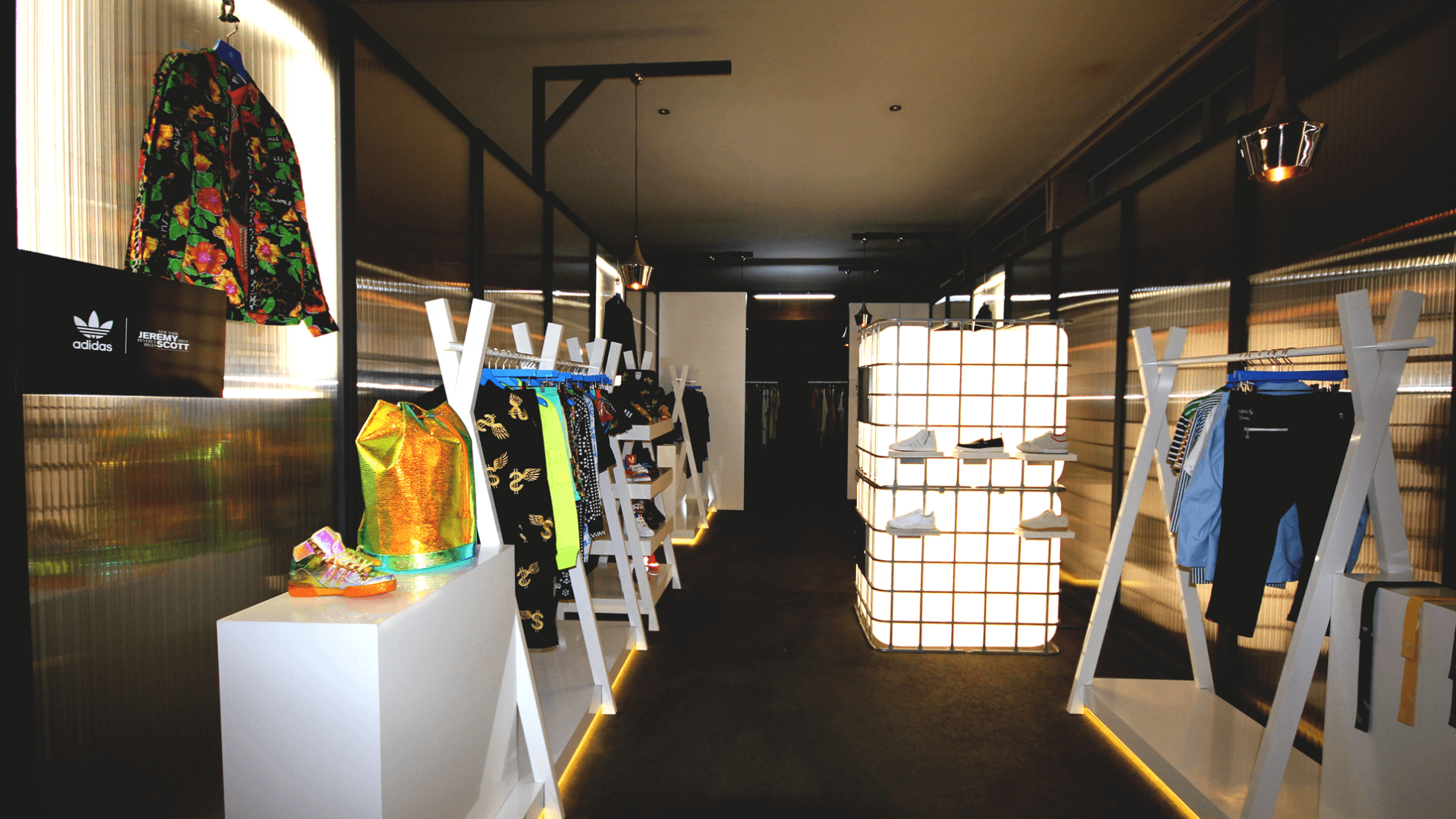
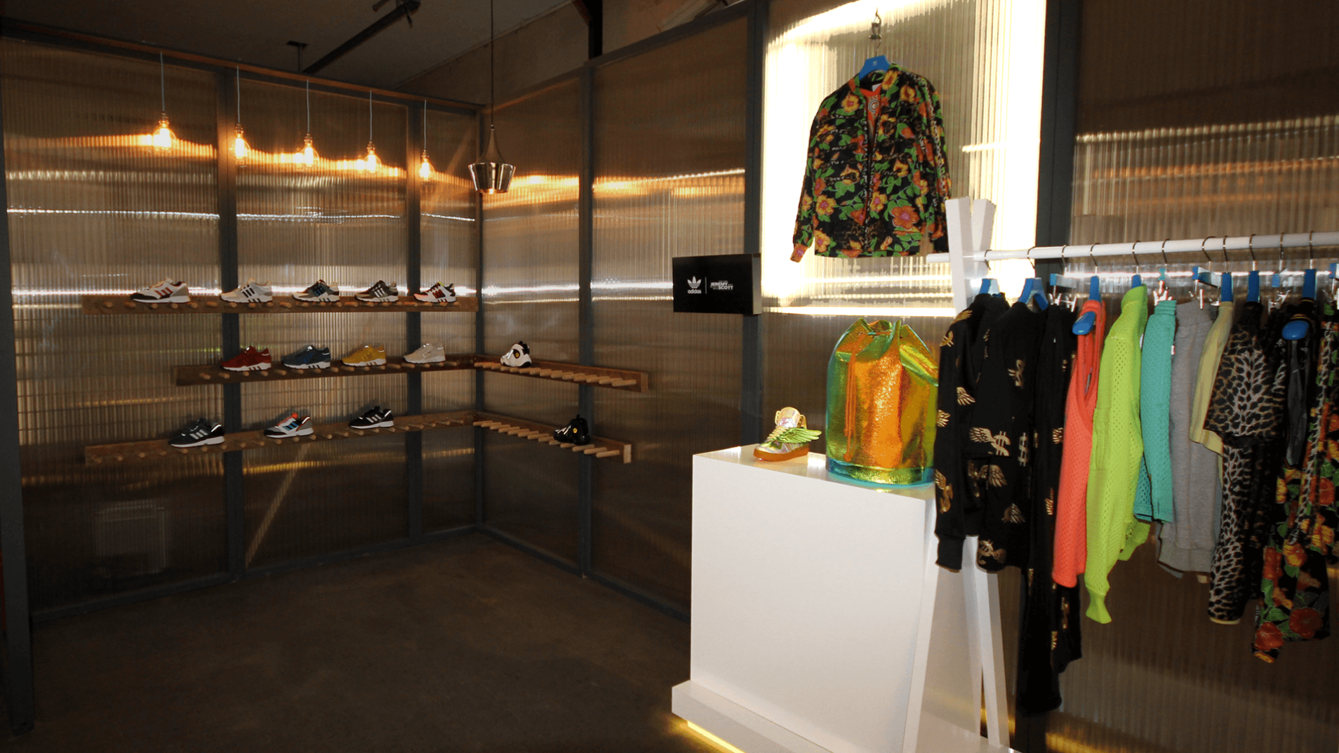
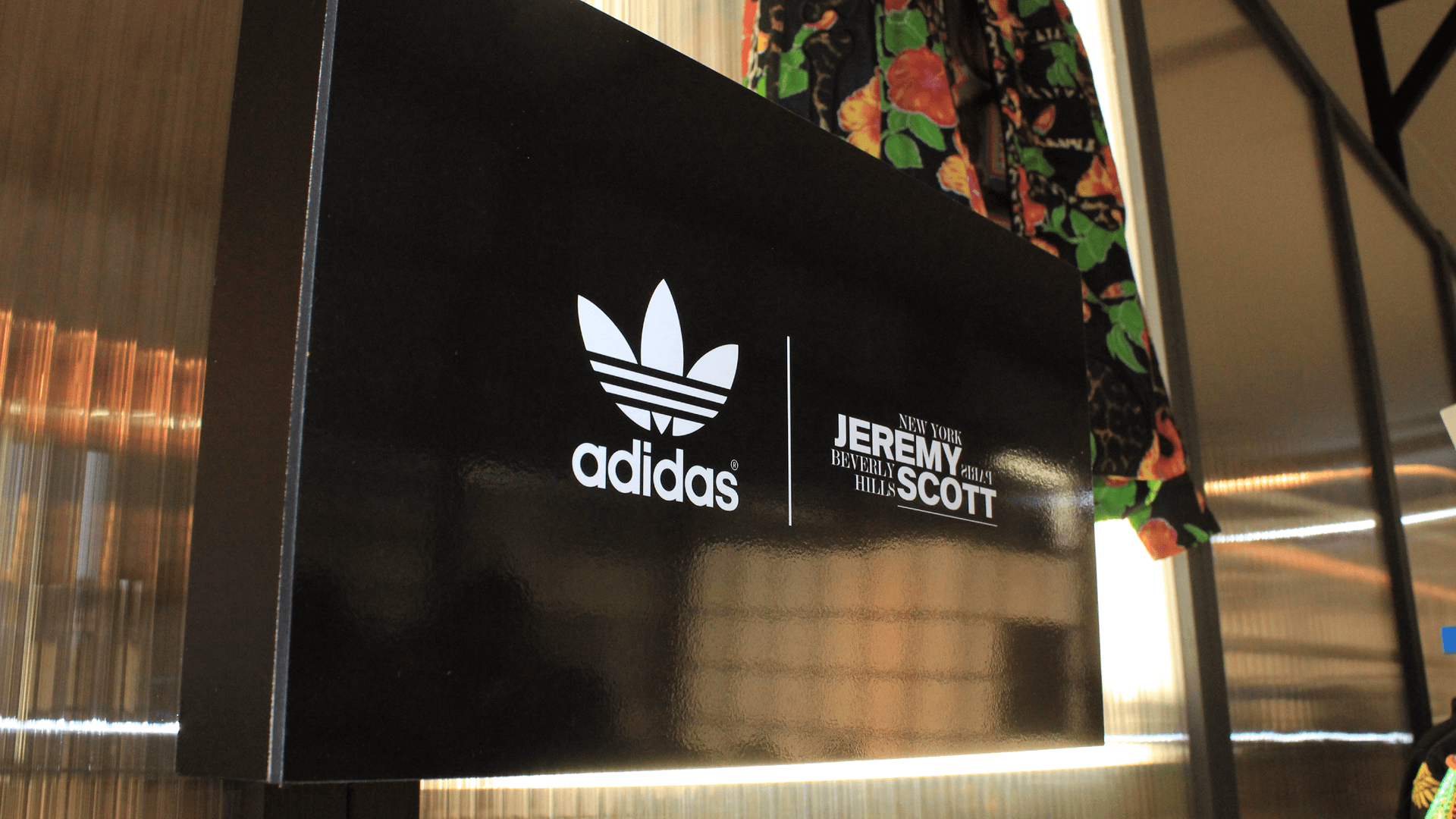
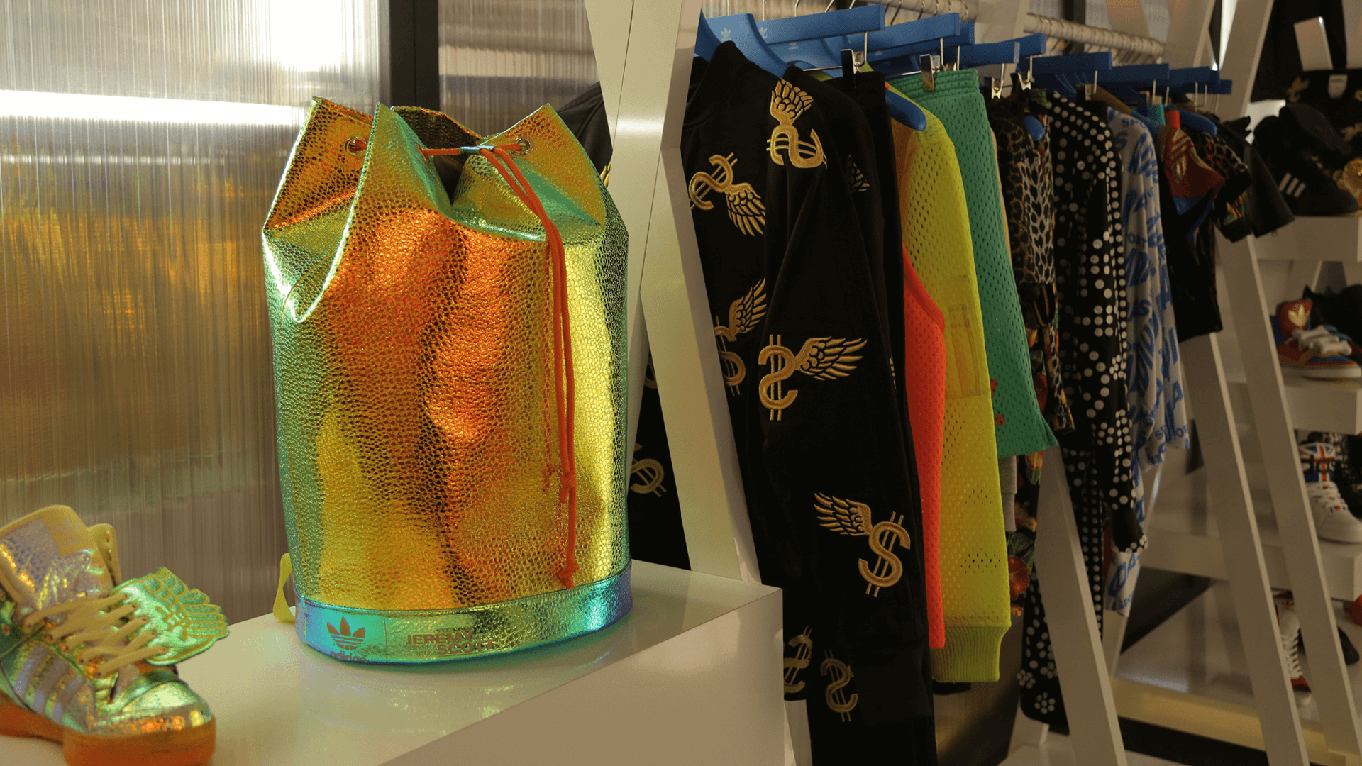
Adjacent to the 520sqm booth sat a premium, invite-only space where the brand showcased statement pieces designed in collaboration with Jeremy Scott.
A change of pace from the main brand experience, this VIP area features a darker environment offset by warm lighting fixtures, including recycled water tanks, and textured cladding to create an inviting atmosphere that encourages dwell time.
Although mannequins are absent, the strategic arrangement of items effectively guides customer choice. Brand presence is subtly emphasised with minimal signage, allowing the products to take centre stage.
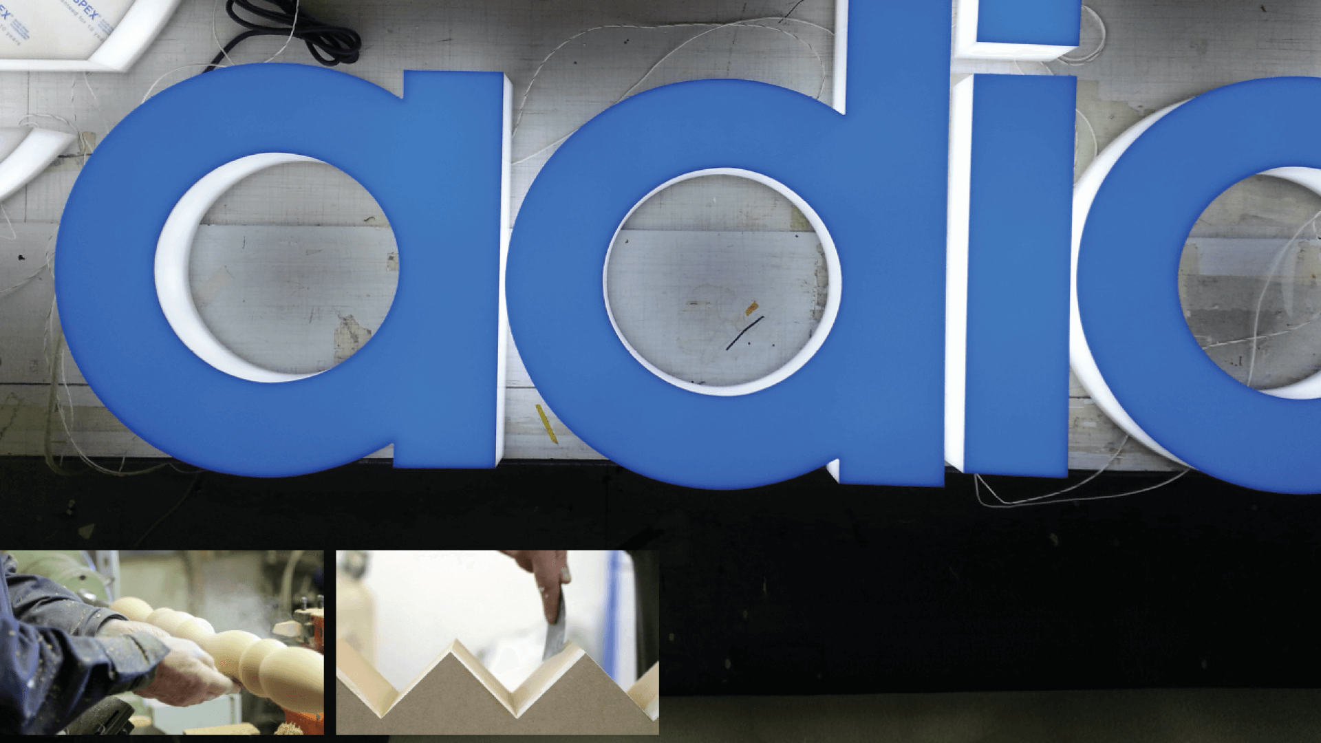
The Making
Watch the whole process – from creative pitch to production and on-site installation all within 9 weeks…

