
Runderwear
Rebrand
Creating a smooth new brand platform and identity for the smoothest running underwear on the planet!
Strategy
|Positioning
|Branding
|No one likes to chafe, especially when running a marathon…or even a 5k! That’s why Runderwear was formed – two guys in Dorset set out on a mission to liberate runners everywhere with their friction-free underwear, allowing runners to do what they love…run free.
Mynt was appointed to assist with evolving the brand’s positioning, identity and marketing collateral – to create a look & feel that embodies the spirit of the brand and benefits of the product.
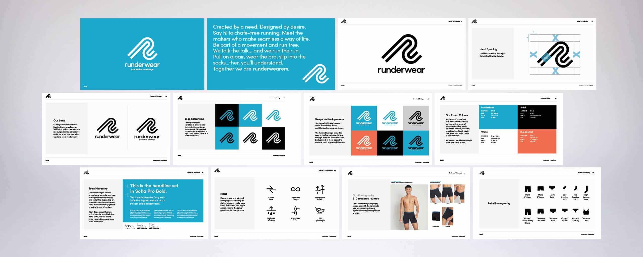
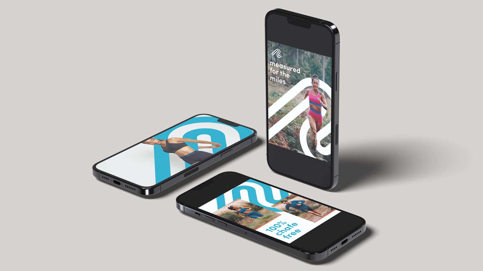
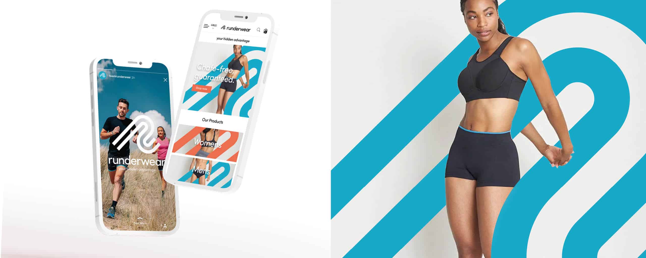
We created a new logo with standalone ident to work across different channels and user experiences, from the eCommerce site to social media, packaging and onto the product too.
Your First Layer,
Your Second Skin.
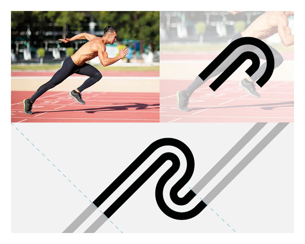
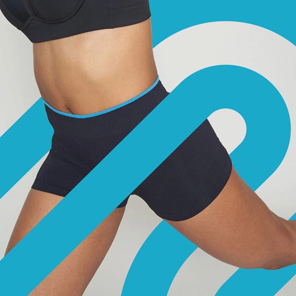
Inspired by the angle and motion of your first running stride, we redefined our shape to create the ‘R’ initial that demonstrates movement. Our double stroke is the nod to the brand seeing themselves as the ‘first layer, second skin’ to the everyday runner, whilst creating a fluid, friction-free ribbon that can become a graphic asset across communications.
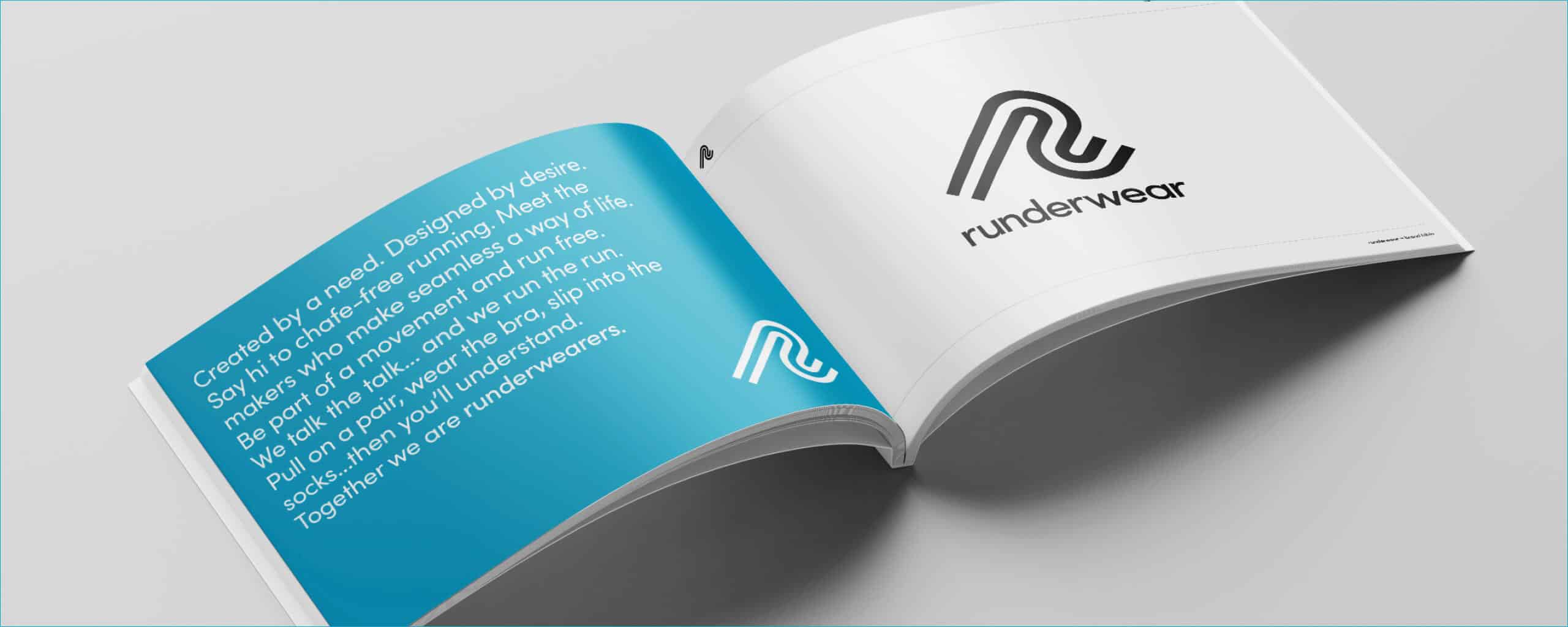
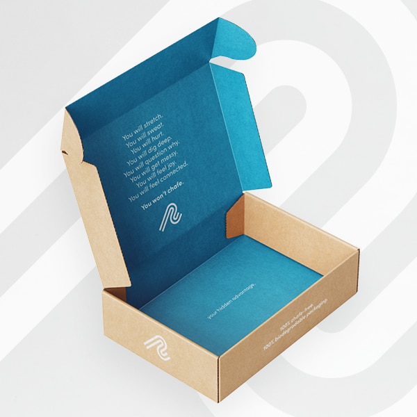
Our Mantra
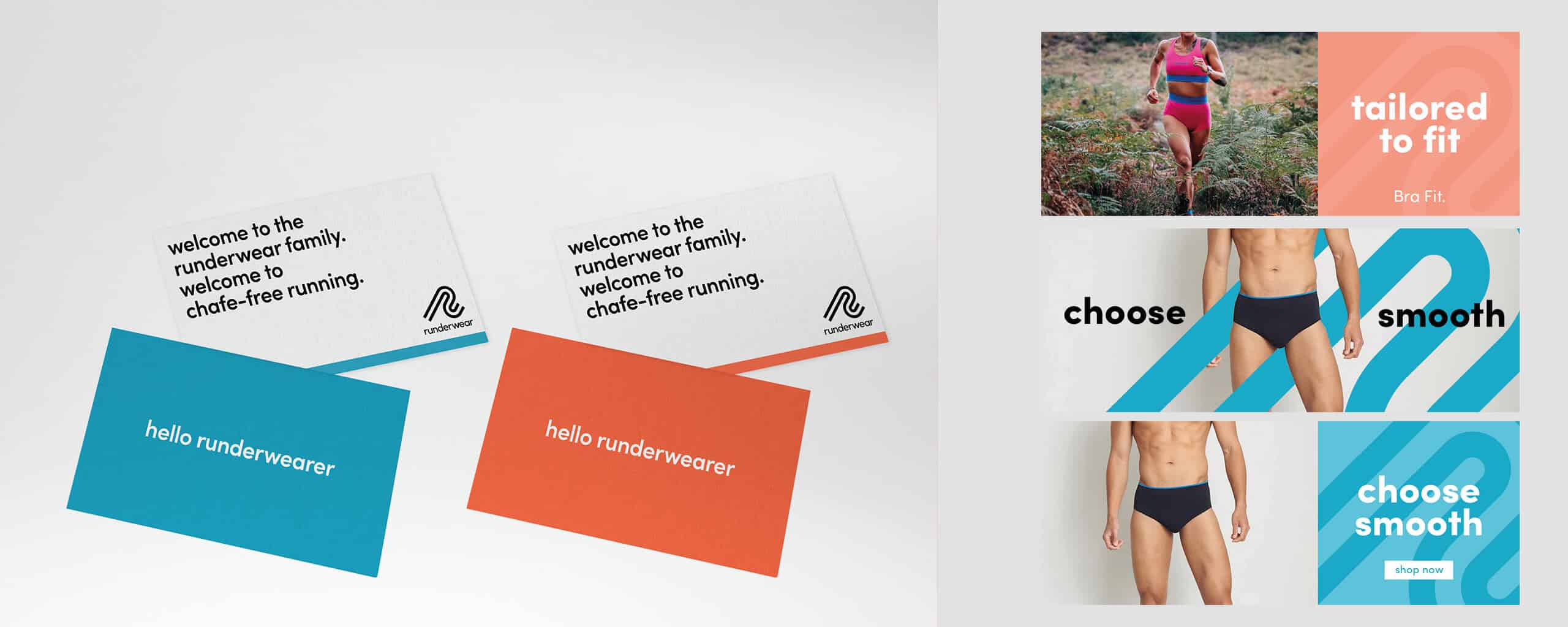
‘Your Hidden Advantange’
We introduced a new brand underpin that nods to the inclusive benefit the product gives to all runners. Sometimes it’s the things you don’t see that give you that feeling of freedom and the chance to perform at your very best. Runderwear really is a runner’s ‘Hidden Advantage’ – allowing you to excel, no matter the distance or your fitness level.
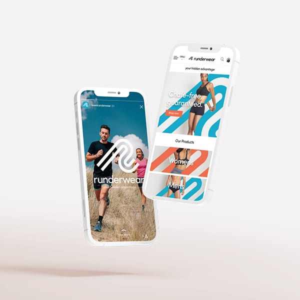
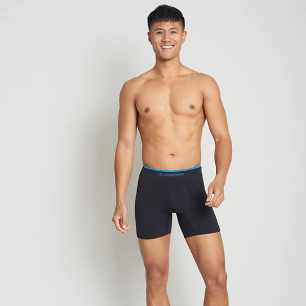
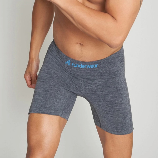
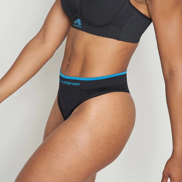
Photography
It’s Showtime
Art-direction for a cleaner, but more dynamic outlook in product photography. Encouraging movement as well as the detail in the garments helps to deliver a more premium aesthetic across all point of sale channels.
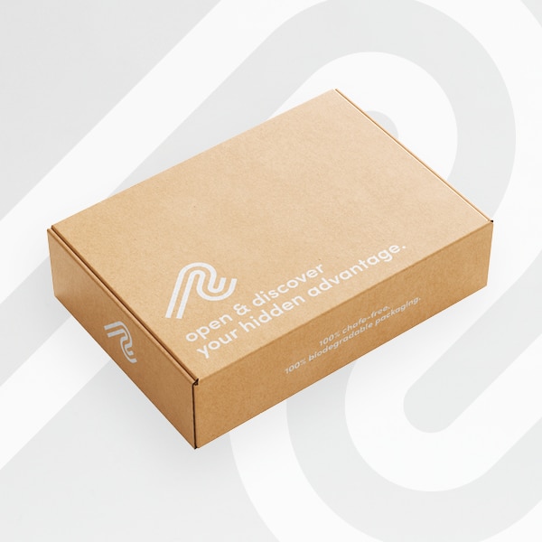
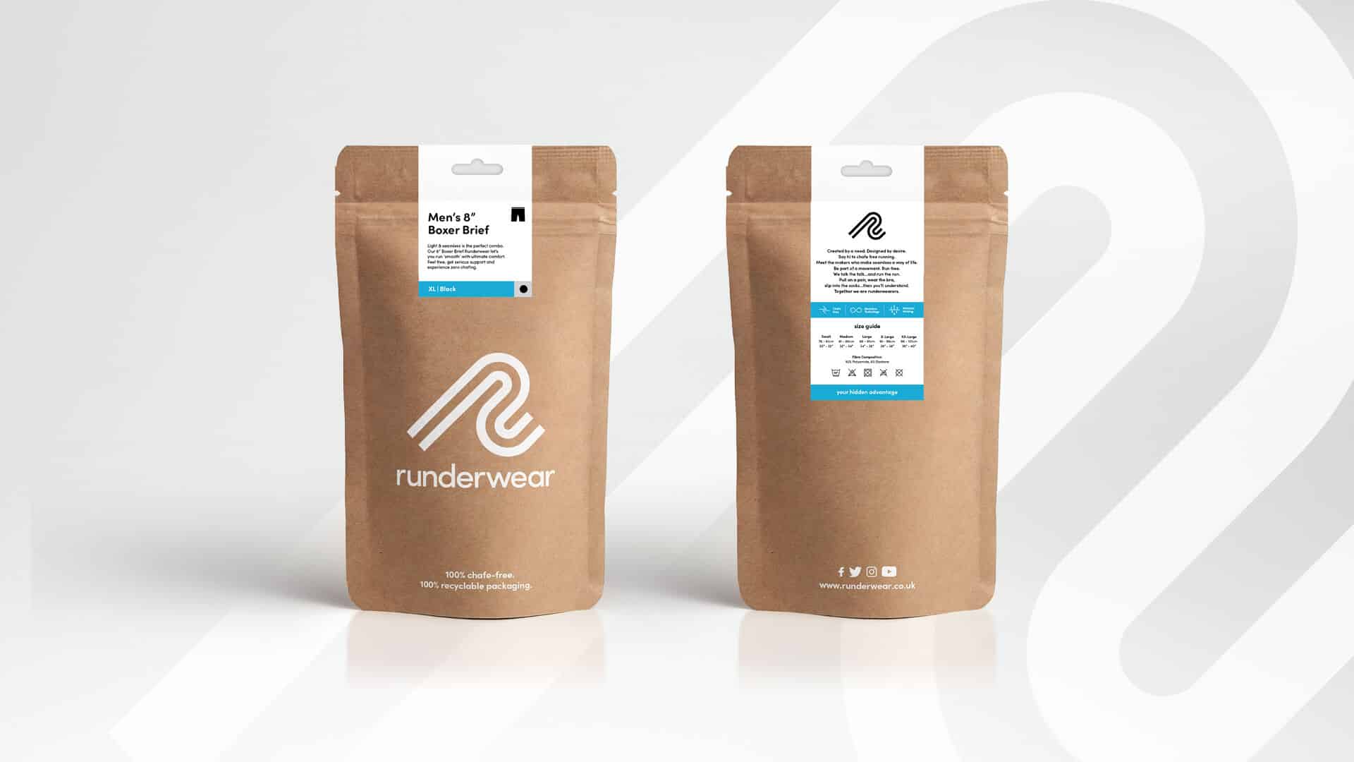
Packaging
Delivering Delight
We designed a product packaging suite that implements our new identity and echos our new tone of voice. We’ve created new packaging solutions that cater for both single and multi product offerings. All are sustainably designed and produced and all confidently elevate this key part of the customer experience.
Iconography
It’s in the detail.
A new iconography suite for the brand.
Clean, simple and minimal, reflecting the styling from our ident. Our new iconography is designed to be used for packaging and online to illustrate the product features and benefits, whilst subtly raising the quality and sophistication of the product communications.
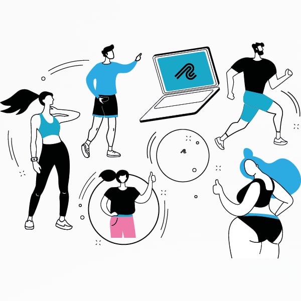
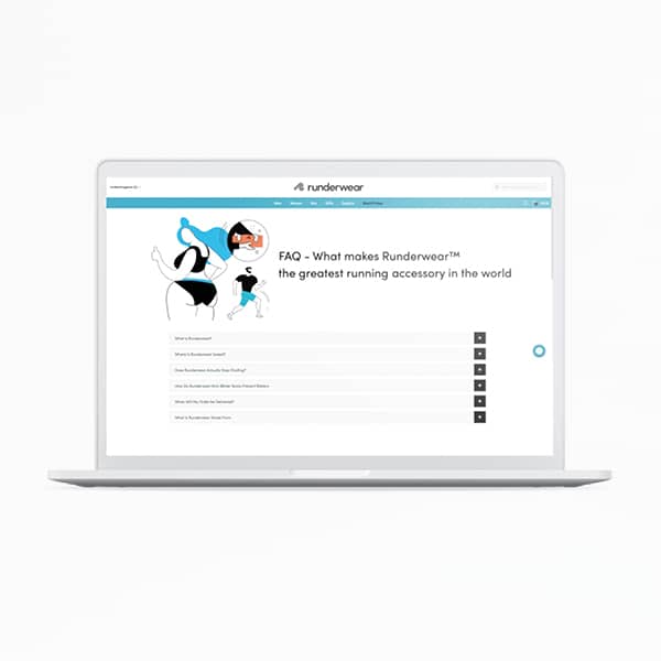
Illustration
Express Yourself
A playful supplementary illustration style that expresses the brand’s personality when talking about things that aren’t their products and more FAQ’S & delivery.
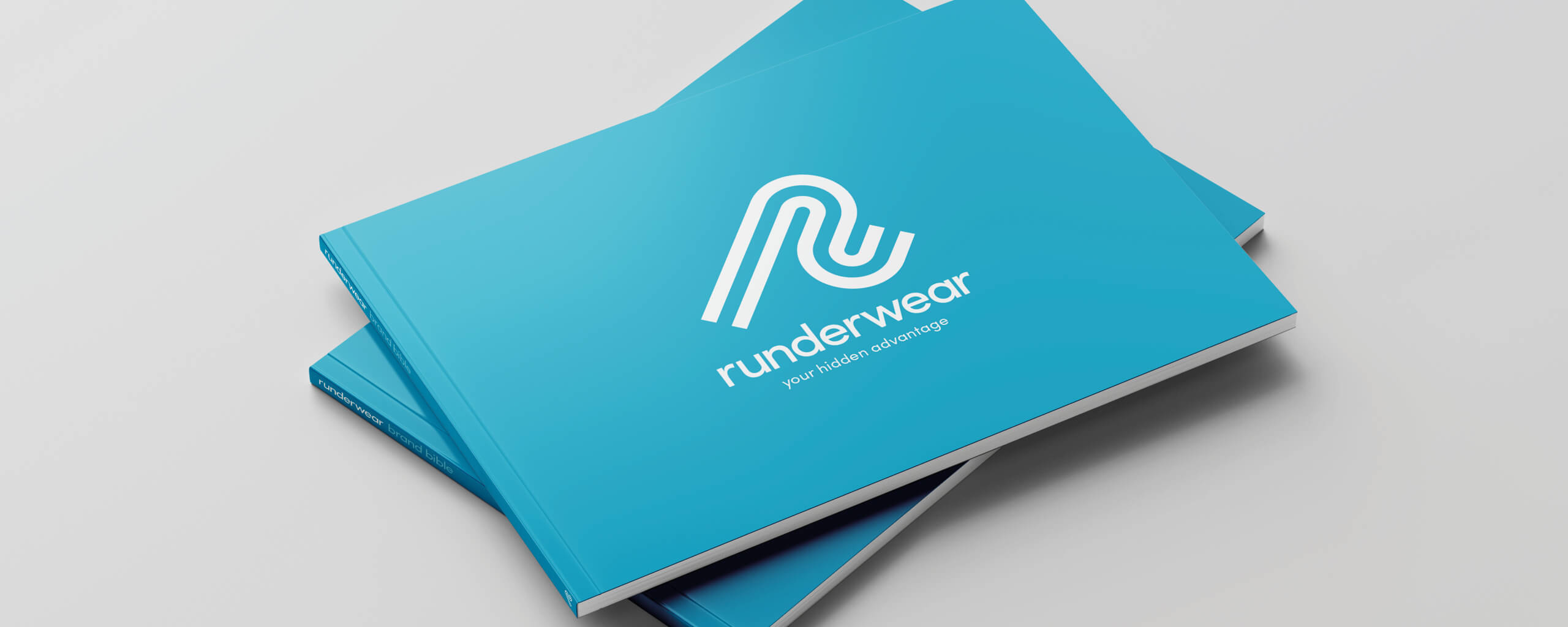
Brand Guidelines
For a Smooth Rollout
Capturing the essence and design styling of the brand’s new outlook, we created a robust set of brand guidelines to ensure consistent application across all touch-points.